Creating interactive experiences in 3D
The exploration and creation of Hubbell’s virtual experiences
Company
Lead UX Designer
My role
1 designer, 4 engineers, 2 product managers
Team
Impact
30%
Customizable templates
50%
Reduction in development
2
Increase in load speeds
Context
Hubbell’s adoption of 3D experiences
Hubbell's business units are experiencing increased demand for product models and 3D experiences, particularly for tradeshows, events, and product launches. The UX team was approached for design and development support to refine these immersive experiences. Our findings lead to the establishment of a standardized design system, ensuring consistency and scalability across all virtual interactions.
Business problem
3D experience and engagement
Currently our virtual experiences vary widely in design, which creates inconsistency in how users interact with them. The differences in controls and functionality has made it difficult and frustrating for customers to navigate and engage with the models.
Goal
Create a framework for Virtual 3D design
Develop a reliable framework that streamlines development, maintains design consistency, and keeps up with growing demand. This will ensure our 3D models are engaging, intuitive, and effective across tradeshows, sales demos, and online platforms.
Process
We tested how people use our current systems, chatting with customers and business leaders, and looking at conversion rates from our trade show tech. These efforts gave us some great insights into what's working, what users need, and where we can improve, helping us create more effective and user-friendly AR and 3D experiences.
Insights
Auditing
We dove deep into research, exploring all sorts of data sources. From web-based virtual experiences to intricate AR models on mobile platforms, we covered it all. Knowing how diverse these technologies are, we didn't just stick to our industry; we also reached out to our users.
What’s not working:
Controls aren’t consistent in size or style, making it hard to tell what’s interactive.
Some buttons don’t clearly indicate they’re for controlling the 3D model, which can confuse users.
There’s no clear visual hierarchy, so things don’t feel intuitive or easy to use.
Button and control styles are all over the place, making the experience feel disjointed.
Adding background elements would make the experience feel more immersive and complete.
Insights
3D workflow needs
We took a close look at web-based experiences, interactive maps, story animations, and 3D model configurations. We needed to understand what makes these systems tick and figure out how we can apply those insights to our own setup. We dug into what each of these systems aims to achieve, and how their goals and features could inspire improvements in our own technology.
What we learned:
Controls aren’t consistent in size or style, making it hard to tell what’s interactive.
Some buttons don’t clearly indicate they’re for controlling the 3D model, which can confuse users.
There’s no clear visual hierarchy, so things don’t feel intuitive or easy to use.
Button and control styles are all over the place, making the experience feel disjointed.
Adding background elements would make the experience feel more immersive and complete.
Findings
Various use cases
We quickly realized that a one-size-fits-all system wouldn’t cut it. Instead, our product needs naturally fell into two distinct categories. First, a feature animation 3D experience with a guided walkthrough—perfect for showcasing functionality in a controlled, narrative-driven way. Second, a self-guided model with interactive hotspots, letting users explore key features at their own pace. By separating these experiences, we streamlined development, reduced complexity, and ensured each approach best represented the product’s real-world application.
Solution
Design
Building the virtual environment
I created a 3D framework to bring consistency to our virtual spaces and 3D models. Right now, our experiences all look and function differently—layouts, controls, and model styles vary without a clear reason, making them confusing to navigate. Some models feel cluttered with extra environments, which not only distracts from the product but also adds unnecessary development time. We now have a grid to structure our content, and visual principles to define the environment.
Why this works:
Supports scalability: A defined environment makes it easier to apply the same system to future designs.
Reduces confusion: Users can use and navigate each experience without relearning the interface.
Product focus: A minimal environment highlights the model instead of competing with it visually.
Look and feel: Aligns layouts, controls, and model styles so every 3D interface feels familiar and easy to use.
Design
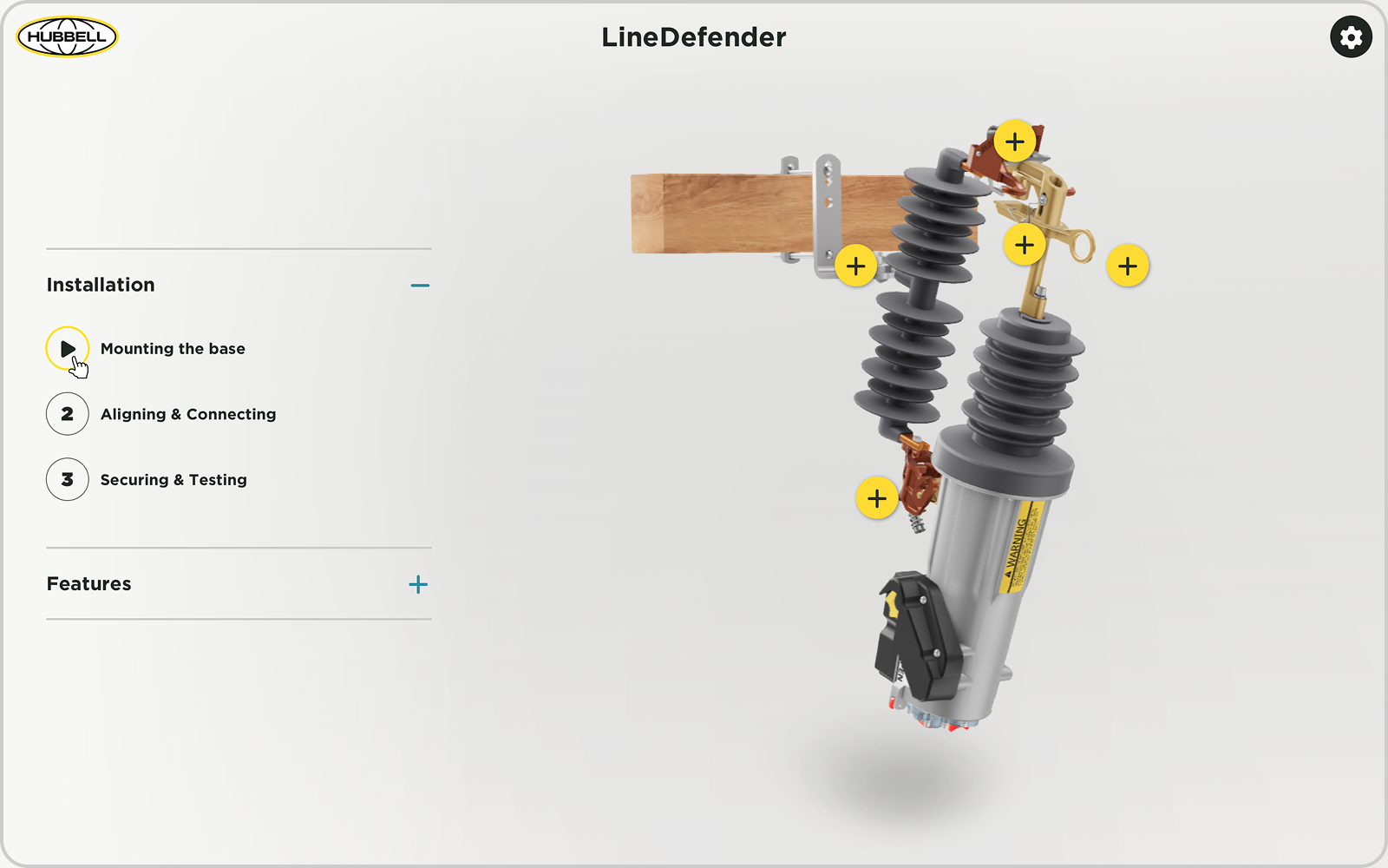
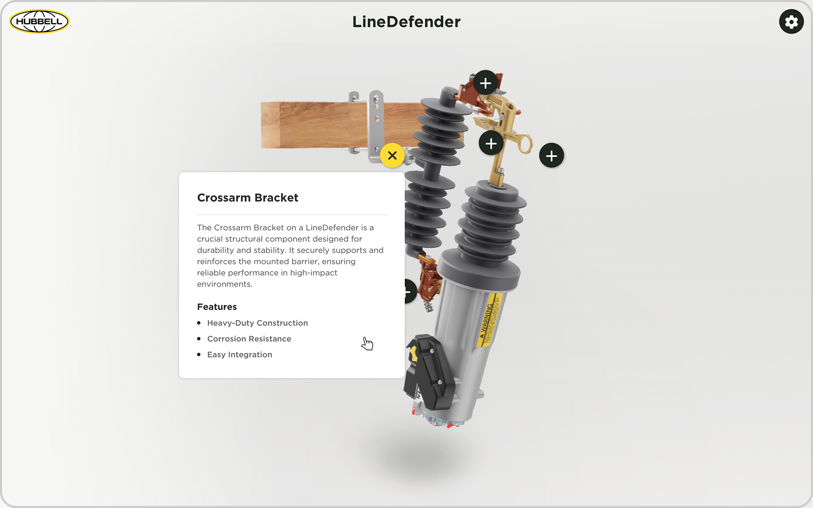
Adding flexible adaptable controls
Since most of our 3D models showcase complex scenarios, we needed a flexible solution for animated content. I designed a floating sidebar, fixed to the left of the model to hold our controls. Now, users have the freedom to click between steps, see exactly where they are in the animation, and collapse it if needed. This keeps all the controls in one place, and works because it can change to fit different scenarios without needing a new design every time.
Why this works:
Scalable: Works across all 3D models without requiring a new layout each time.
Consistent: Ensures all 3D interactions feel familiar and easy to navigate
Organization: Keeps the interface organized without overwhelming the screen, the focus still remains on the model.
Flexible: Supports step-by-step guides, feature highlights, and categorized content.
Guidelines
Documentation of 3D components & assets
None of our existing frameworks fully met our needs, so I worked closely with our development team to create a new design system. Now with the addition of a UI component library, we have a place to store design assets and provide documentation on how to use it. This makes it simple for both our teams, while making sure our products are presented in a unified manner.
UI Component Library
Zeroheight Guidelines
Results
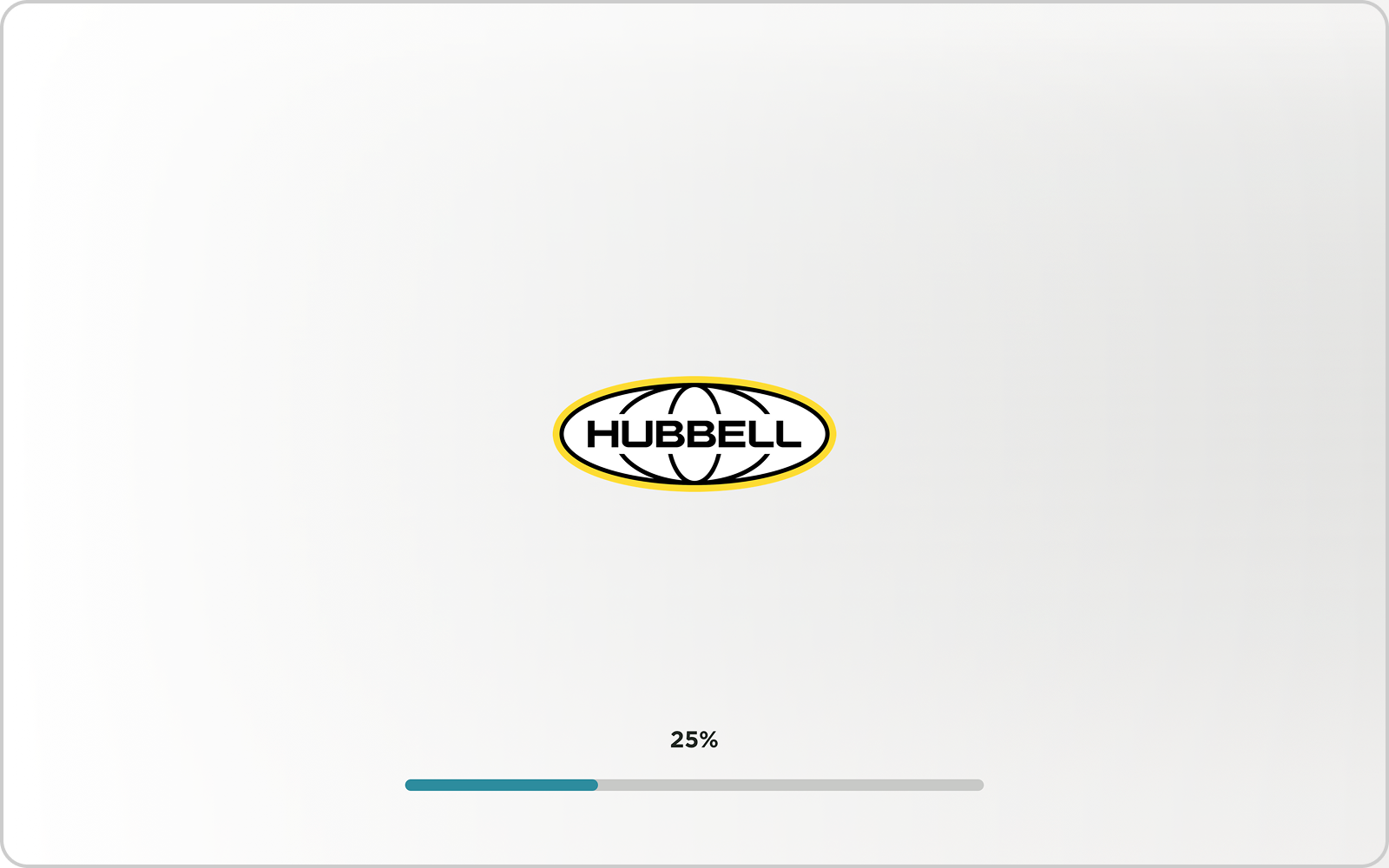
The loading screen
We added a loading screen to help set the tone before the 3D experience even starts. It’s not just there to show progress—it gives users a smooth entry point, showing the brand and a background that already feels like part of the model’s world.
Guided experience
The guided experience layout is all about helping users feel confident as they explore. It gives them a clear, step-by-step path to follow, making it easy to understand key features without feeling overwhelmed.
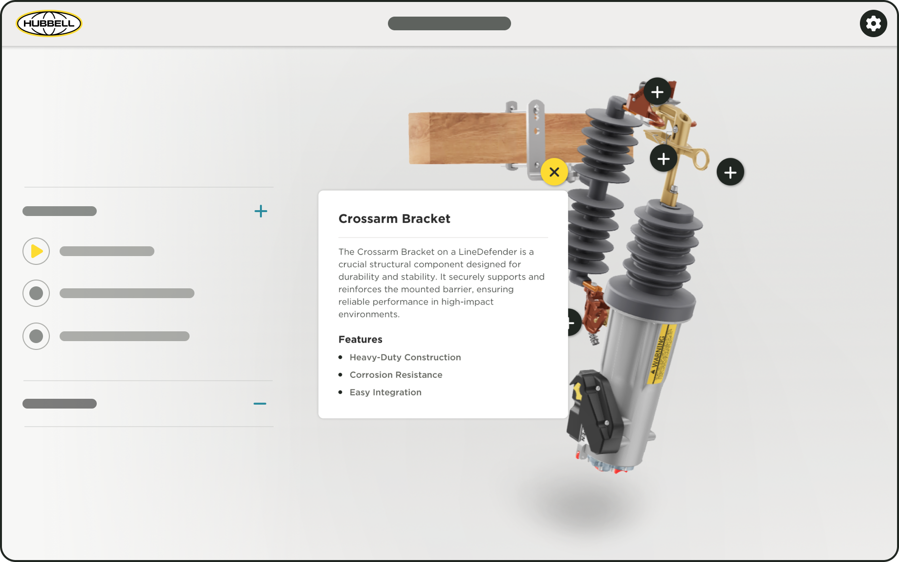
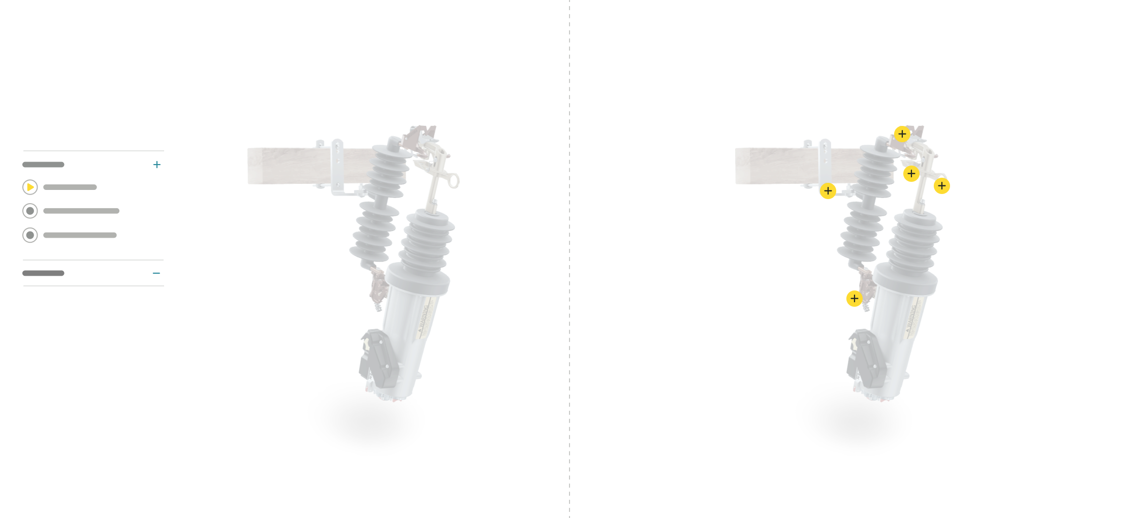
Self-Guided experience
This layout offers a simpler, more open-ended way for users to explore our products. Instead of leading them through a set flow, users can click directly on product points placed on the model and dive into the details that interest them most.
Reflections and Takeaways
Working with the team in India to build this new 3D template was a rewarding experience. It was my first time creating a design system from the ground up, and I learned so much about how to structure something that’s flexible, scalable, and visually consistent. Getting to collaborate across teams made it even more impactful.
View more work
Enhancing Hubbell’s design system with a customizable inset banner module
The development of Hubbell's digital guidelines and design system