Design system
Enhancing Hubbell’s UI kit with a customizable inset banner
Company
My role
Lead UX Designer
Team
1 designer, 4 engineers, 2 product managers
Impact
27%
Decrease in user drop-off
35%
Increase in asset downloads
2
Increase in scroll-through engagement
Context
As part of Hubbell’s push to modernize our web experience, we saw an opportunity to improve the lower section of our pages. I was tasked with creating a modular component that could flex across a range of content needs to support key CTAs like brochures, contact links, and corporate cross-promotion.
Business problem
The bottom of our webpages lacked engagement. Visitors often scrolled past important content or exited the page before viewing key information. We needed a better way to surface this information earlier, in a way that felt purposeful and easy to interact with.
Process
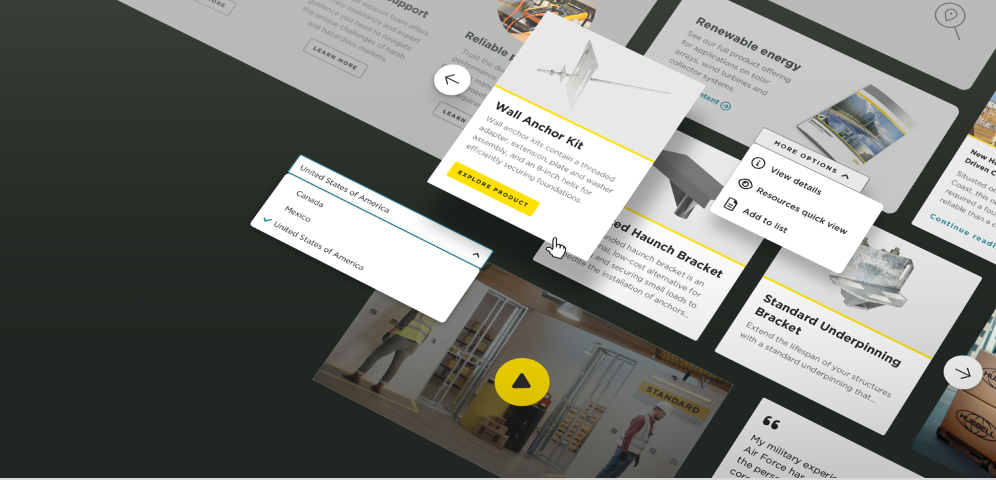
Iteration 1
Adding a full width image banner
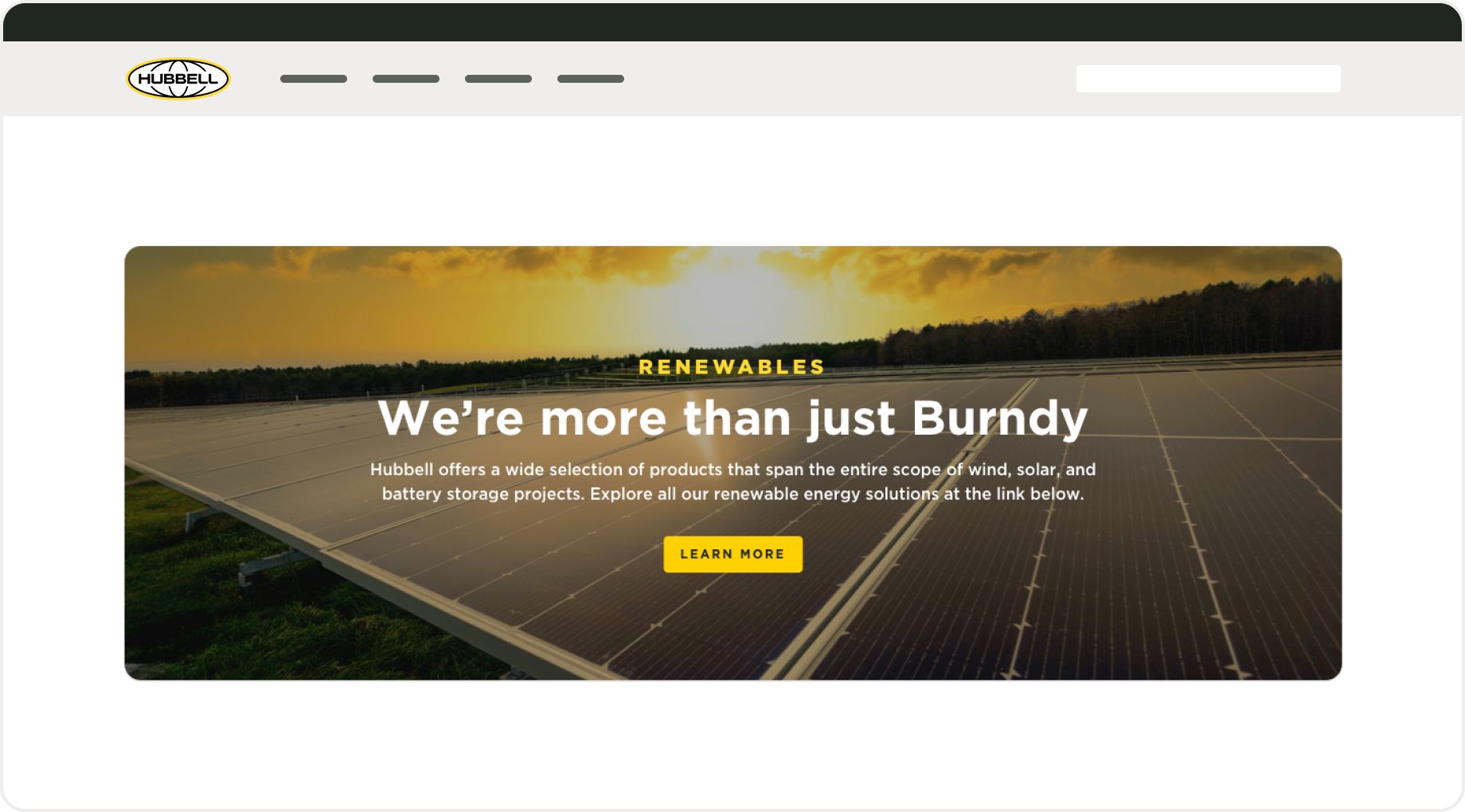
We launched with a full-width approach: bold background colors, prominent buttons, and large imagery. That version took up too much space and visually clashed with the footer. On smaller screens, it felt especially bulky and often got ignored—it looked more like an extra footer than a meaningful prompt.
What’s not working:
Took up too much space:
It made the bottom of the page feel crowded
Clashed with the footer:
Visually, it felt like there were two footers stacked together
Got overlooked:
Users either skipped over it or assumed it was just part of the footer
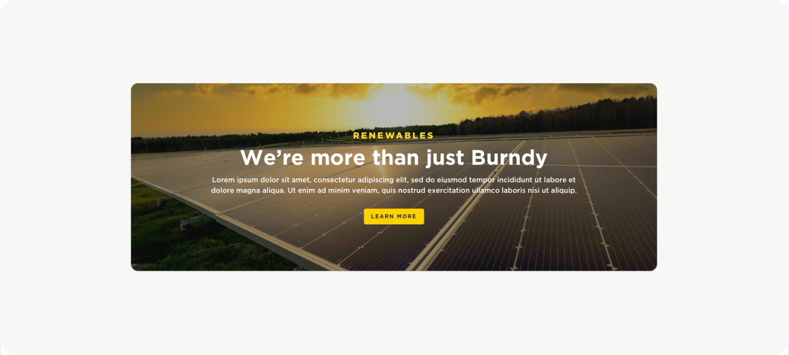
Iteration 2
Combining styles with our product listing pages
After internal testing and feedback, I focused on reducing horizontal space. I drew inspiration from our team’s efforts to modernize the product listing pages, which featured inset content to create clear separation between the product listings and their featured content. Using a similar approach, I was able to preserve the visual impact of a full-color takeover banner while insetting the content to create distinction from both the banner and the footer.
Why this works:
Visual Interest:The full-color takeover banner maintains a strong visual presence, drawing attention without overwhelming the content.
Modular component: The design pattern is reusable across different sections, supporting consistency and scalability.
Compact design: Reducing horizontal space improves readability and focuses user attention.
Content Focus: By separating the content from the banner and footer, users can focus more easily on key information without visual distractions.
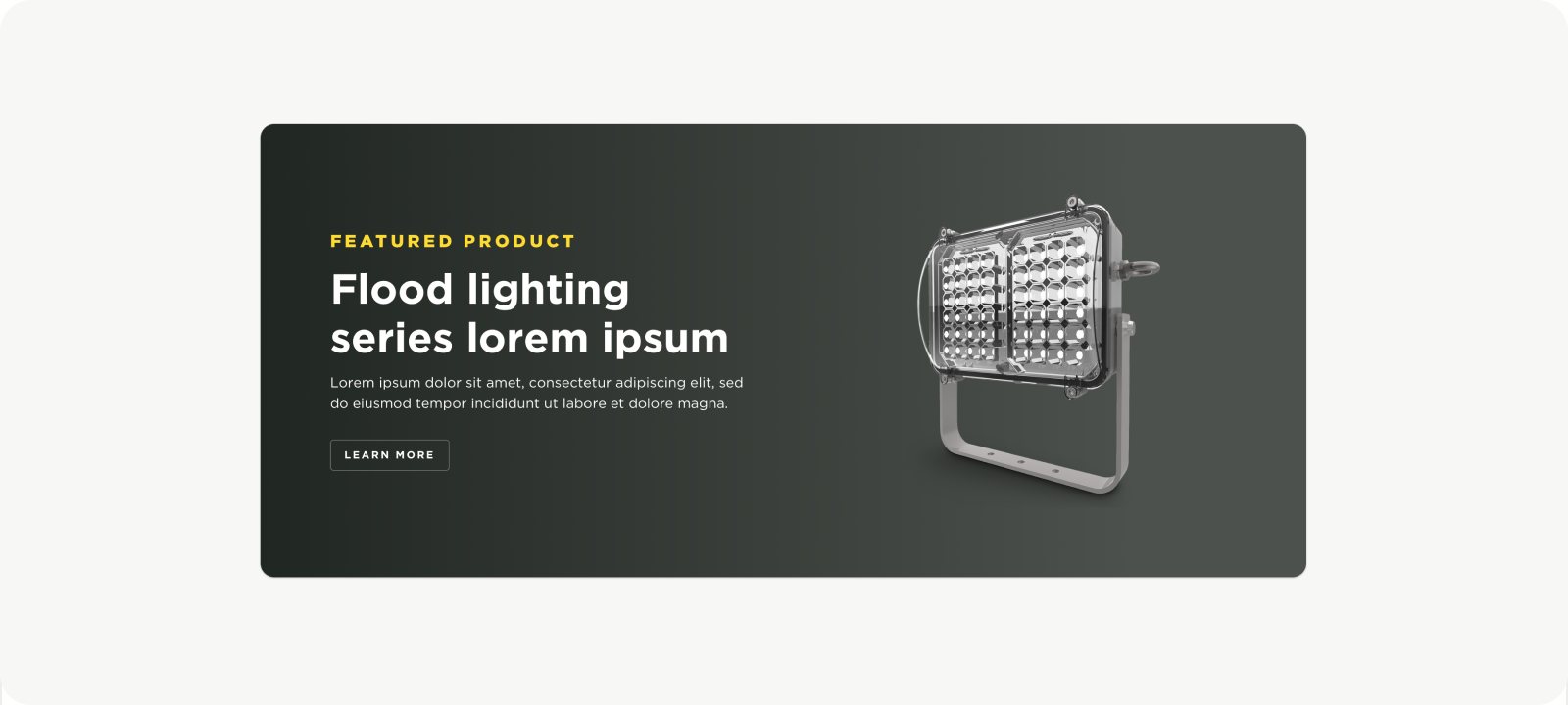
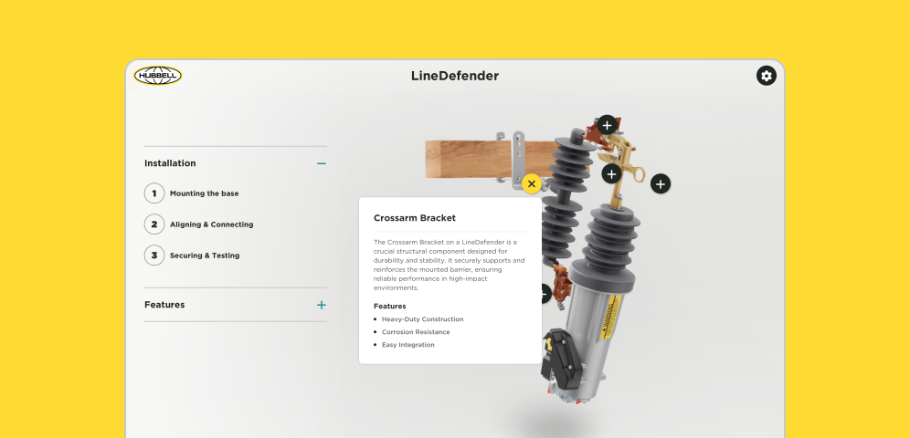
Design
Creating flexible styling and layouts
Once I established the component and got buy-in from the team, I worked on creating a range of layout variations. We needed additional formats to support product imagery, document and resource mockups, and brand endorsements. I defined both single- and multi-column layouts and outlined how they should scale and adapt across different screen sizes.
Why this works:
Supports Content: Handles everything from product images to documents and brand elements without needing custom layouts for each.
Flexible: Single- and multi-column designs provide structure for both simple and complex content.
Streamlines Process: Reusable layouts reduce the need for one-off solutions and speed up implementation.
Visual Consistency: Shared structure and spacing across variations help keep the interface clean and aligned with the design system.
Final result
Drawing interest with impactful bottom CTA’s
This layout prioritizes visual storytelling through a bold, full-color image background that spans the width of the page. It’s ideal for high-impact moments, such as product or campaign banners, with centered content that draws immediate attention.
Featured product highlights and resources
Designed for clarity and focus, this two-column layout uses a clean, neutral background to foreground product visuals or downloadable resources. It works especially well for modular content, allowing easy stacking of product specs, feature cutouts, or support materials.
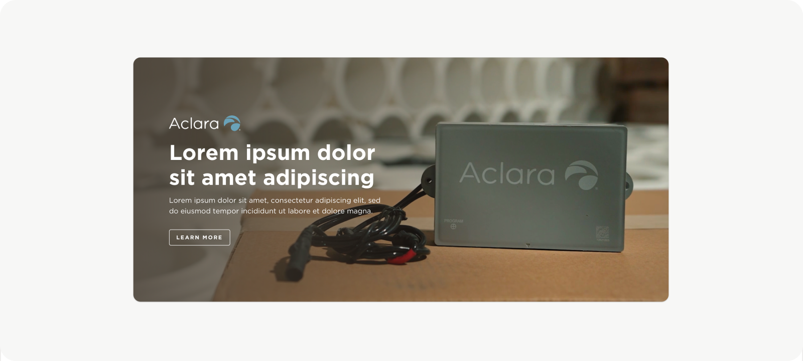
Endorsed brand or third-party callout
This layout incorporates brand elements—like logos or subtle eyebrow headers—to contextualize the content within a specific product line or application. It’s particularly useful for showing how products are used in real-world settings while reinforcing brand identity.
Reflections and Takeaways
I saw this project as a chance to grow beyond the design work itself. Presenting my ideas clearly and working independently gave me more confidence in my decision-making. I also spent time collaborating closely with developers, which helped me better understand technical constraints and how to design with implementation in mind.
View more work
The development of Hubbell's digital guidelines and design system
The creation and development of Hubbell’s interactive virtual experiences